As part of this brief I want to change how the council is viewed. To do this I feel like I should apply the brand to elements of the city which will be considered 'good', or beneficial to the community. Associating the council with positive developments.
An example of this is York Minster, the pride and joy of York which tourists travel thousands of miles to see. However, it's always covered in scaffolding, which obscures the look of The Minster, making it look like a building site.
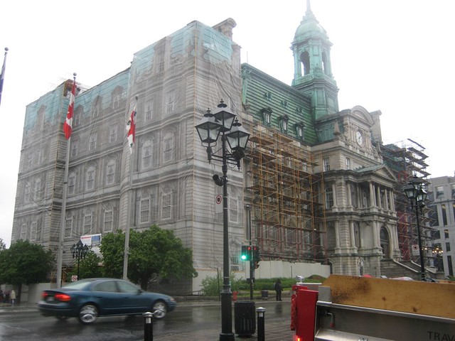
Some research has brought me to see examples like this, using the a screen to cover up the scaffolding and the works beneath it, almost restoring the looks of the building while it's in a fragile state.

I decided to apply it to York Minster. I found an image of the scaffolding which obscures the left tower, hiding it from display, exposing the ugly scaffolding, which is an eye sore spoiling the skyline of the city.

I mocked up a cover for the tower, using the tower to the right and manipulating it onto the left tower to act as a cover, obscuring the eye sore which is the scaffolding. I applied the brand colour to the image which resonates the brand whilst rectifying the skyline, positively promoting the council - I added the logo just to increase the brand exposure.
Leave your comment